Today I thought I would share a little step-by-step chalkboard art design! I’ve had this quote on my heart lately and wanted to letter it out. “Believe in your dreams. They were given to you for a reason. -Katrina Mayer” I have a big announcement coming on Friday that will explain why this quote has been sticking with me! Until then, I hope you enjoy this project!
Step 1: Pencil Sketch
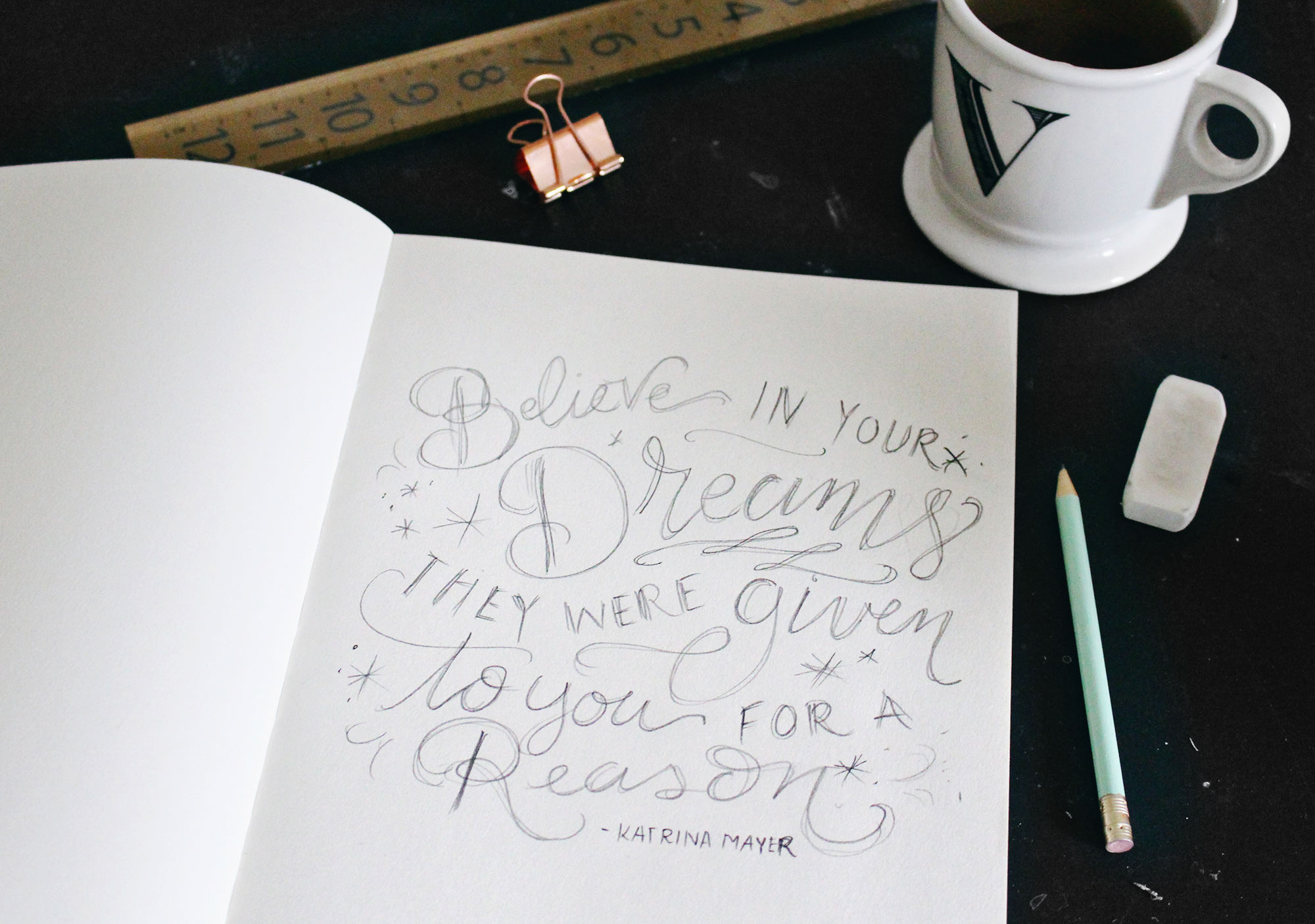
I always start my designs with a rough pencil sketch. This helps me experiment with different layouts and make sure the letters are fitting well together in the design. This was the sketch I landed on for this quote. I want to make it feel airy and a bit magical with the starbursts and swirls.
 Step 2: Add Guides
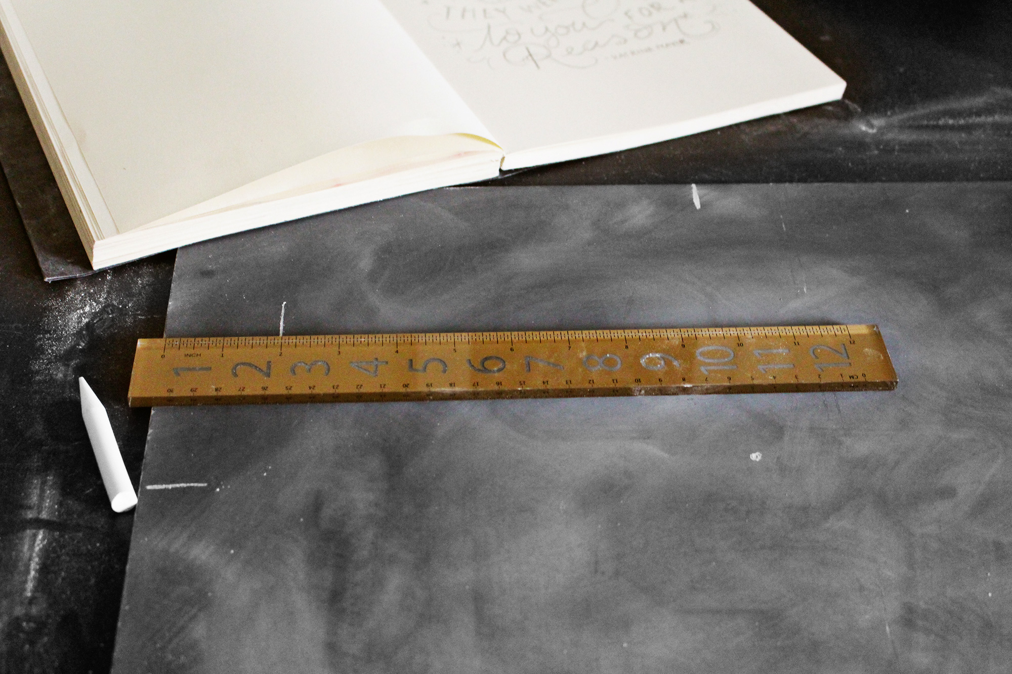
Before transferring the design onto the chalkboard, I sketch out guides. I find the center point at the top (which is 10 inches since I’m using a 16×20 chalkboard), the center on the side, and my true center. Since I want to make my drawing a square, I also include guides on the sides to keep it in the right proportion.
 Step 3: Prepare The Surface
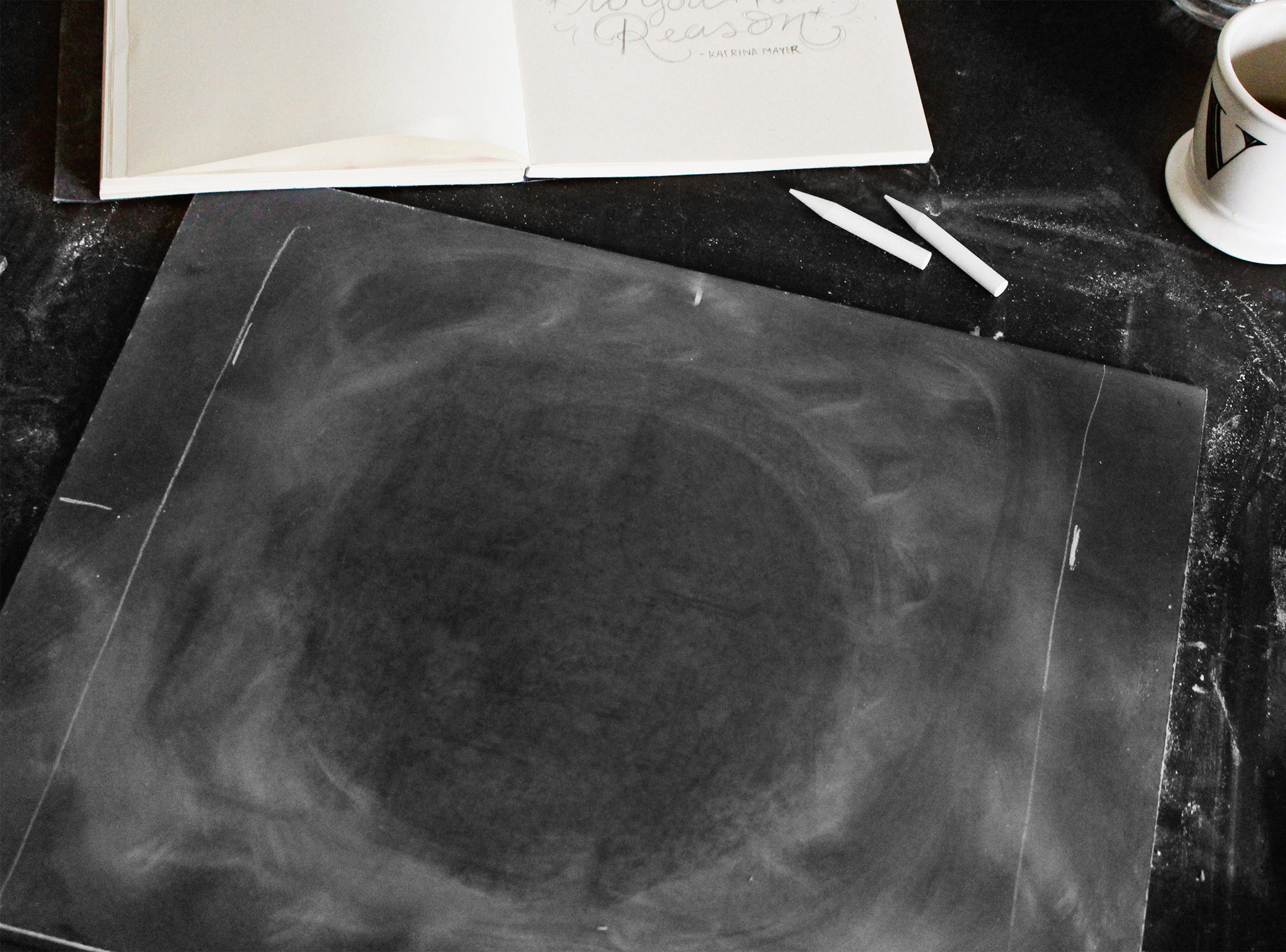
Sometimes I like to start a design with zero dust on the surface, but because I am going for an airy look, I added purposeful dust around the board and removed the dust from a portion of the center. This will provide a nice, textured backdrop for my lettering.
 Step 4: Start Lettering
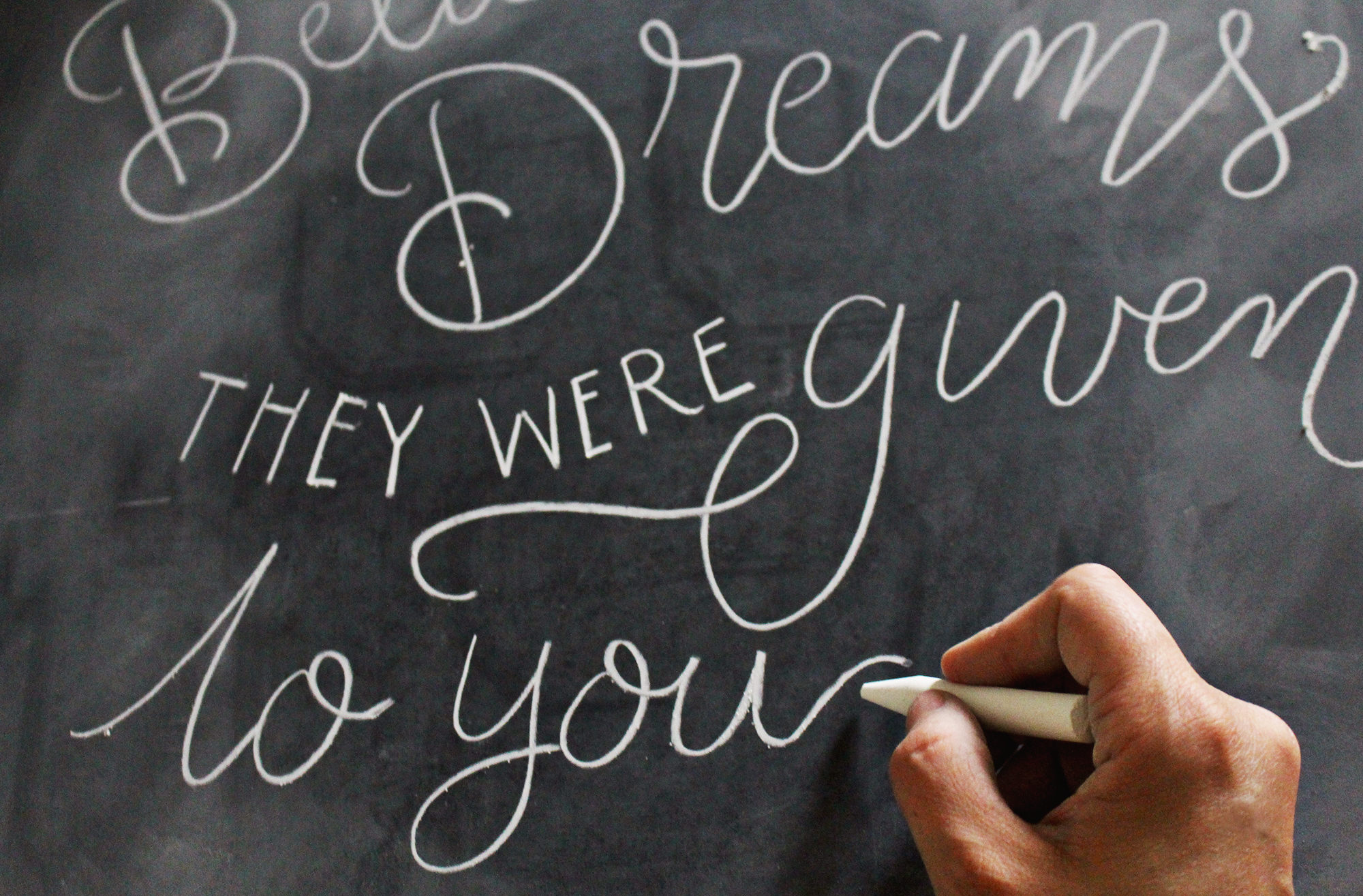
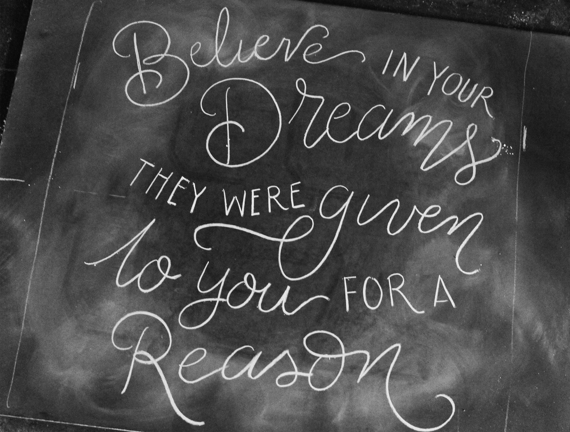
This first pass of letters does not need to be perfect by any means! This is what I call the “skeleton” of the letters. They will be thickened and polished, but for now, I’m making sure that all of the words fit the way I had planned in my pencil sketch.

 Step 5: Thicken & Polish
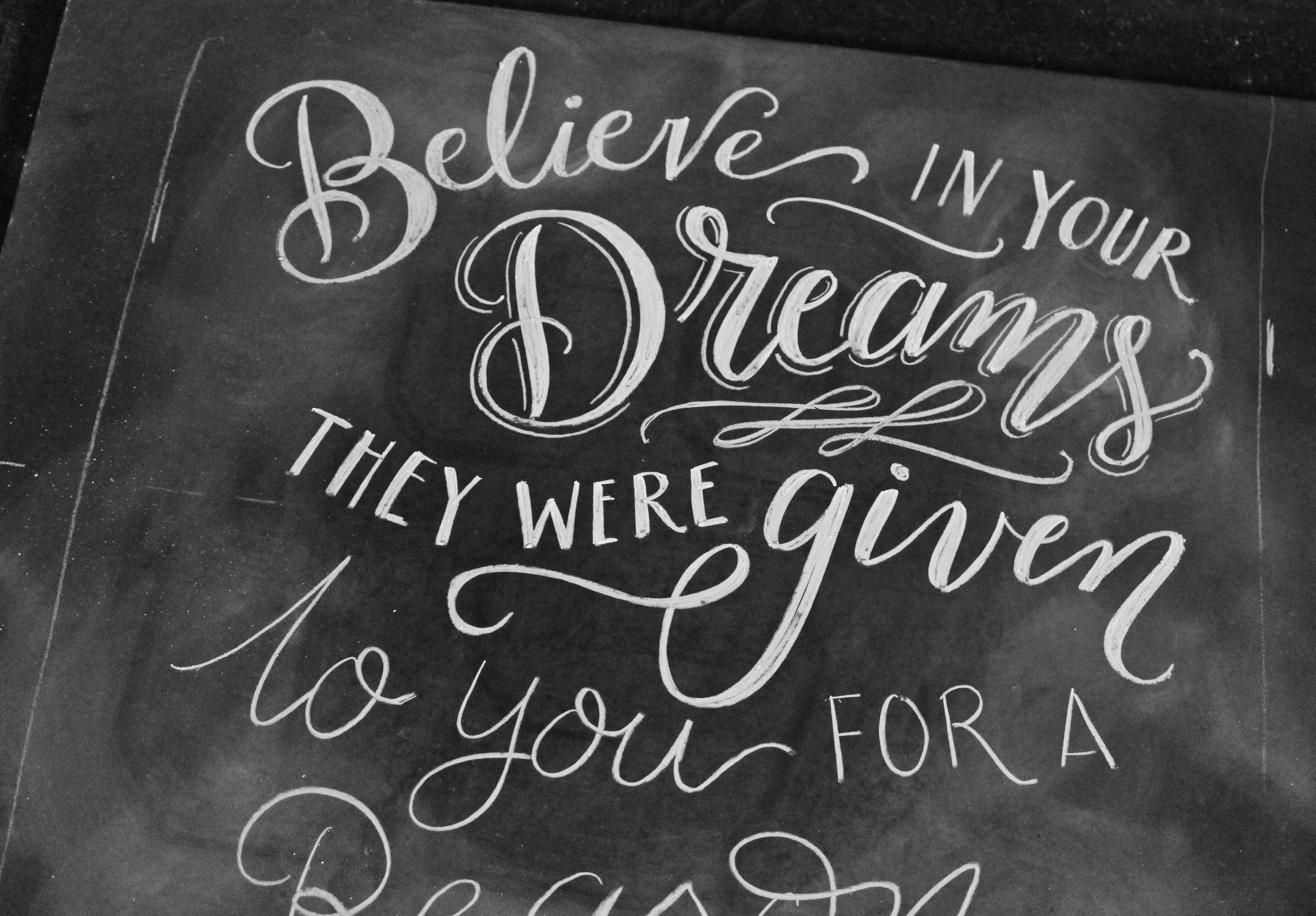
Now that my skeleton is drawn and I know everything fits just right, I go back to the top of the design and start thickening and polishing the letters. Because I want to create a calligraphic, script style, I thicken the downstrokes of the letters. Think of your hand-writing: anytime you would pull the pen toward you (down), that part should be thicker.
 Step 6: Work Your Way Down
Now that I’m drawing the final design, I don’t want to disturb the finished portions. Working in a “top-down” approach fixes this. That way, I can rest the side of my hand for precision, which is especially necessary when drawing details like shadow lines on the letters!

 Step 7: Add Details & Create Balance
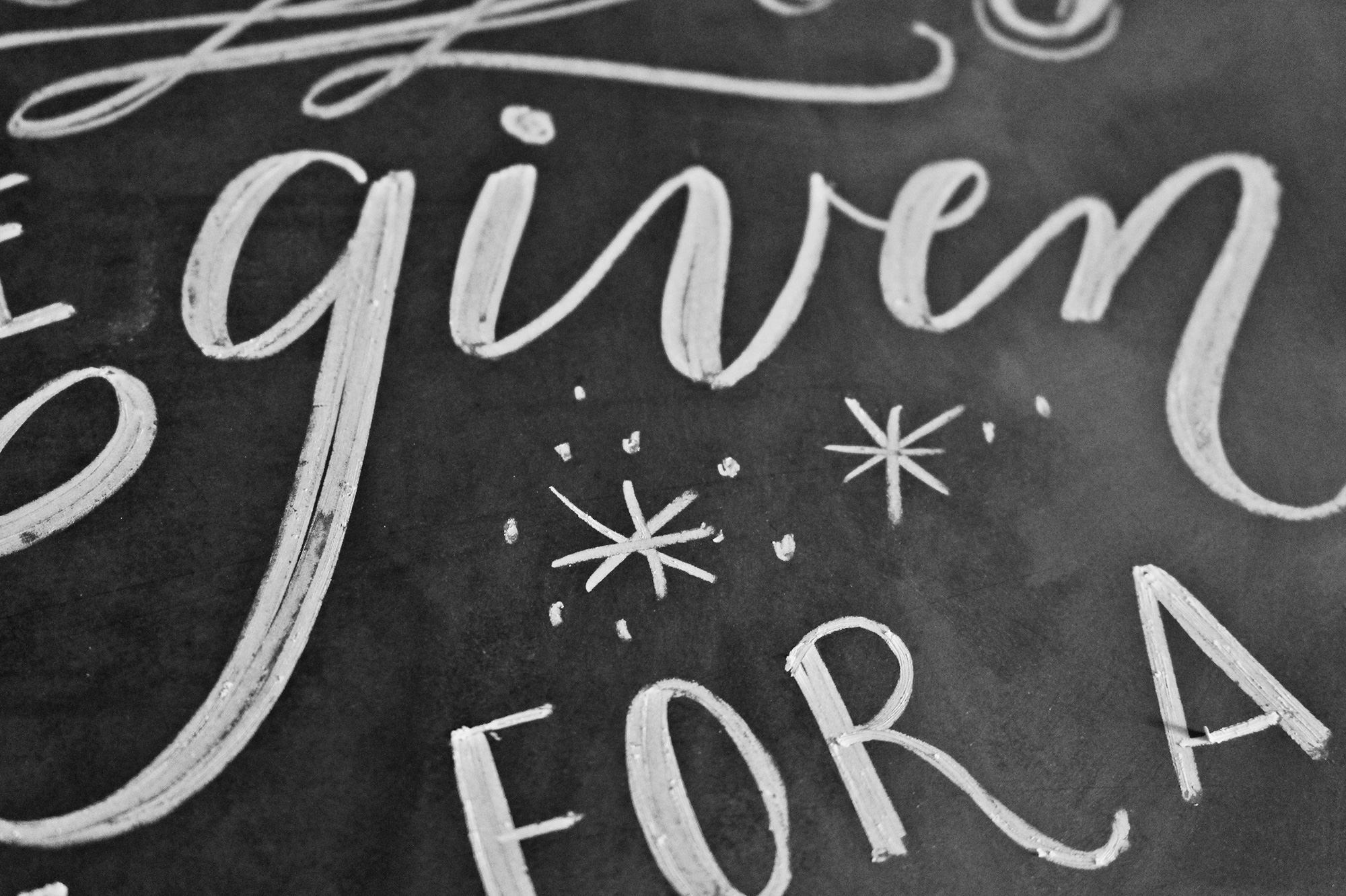
Now that the main portions of my design have been drawn from the top-down, I can go back in and add my details! For this piece, I added starbursts and tiny dot details to give the appearance of stars and sparkles. If any portion of the design feels unbalanced, I can add an embellishment like this to fill the space.
 Here is the finished design!
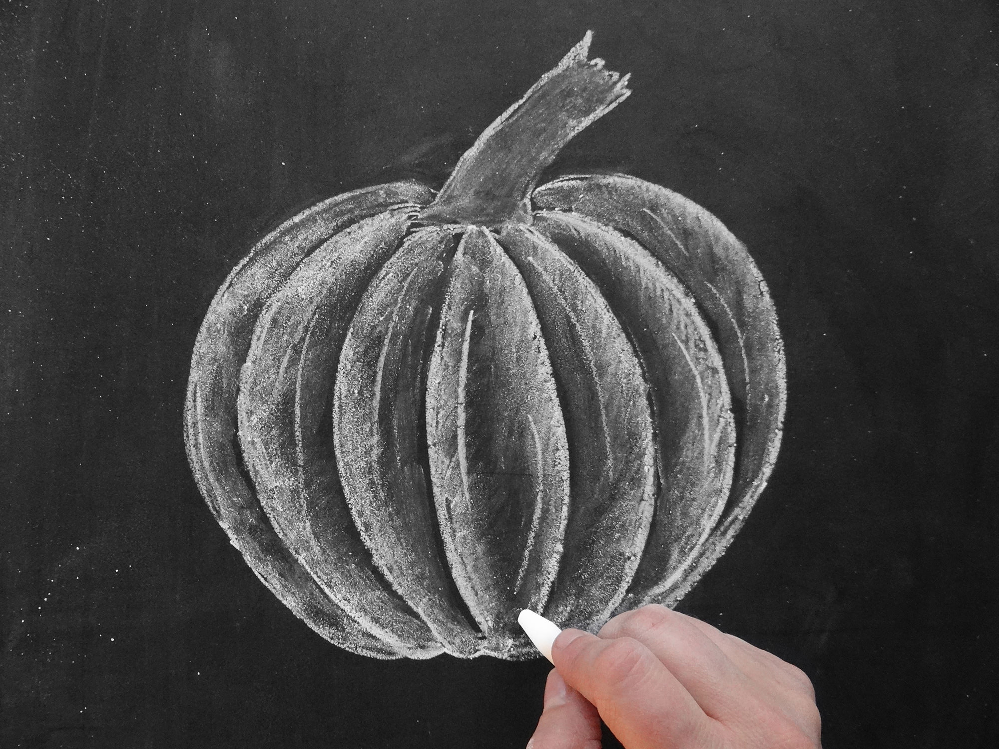
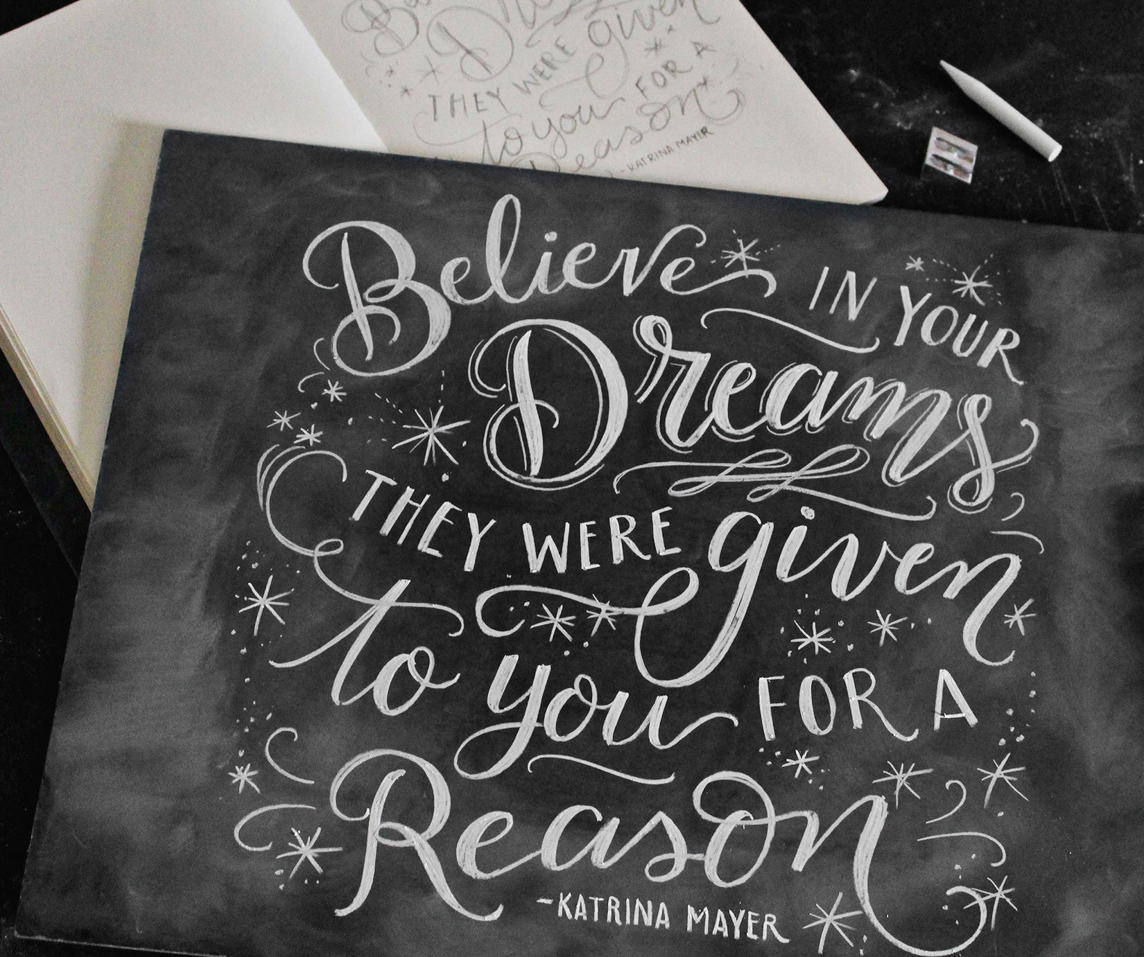 Some Things To Note: I am using Crayola white anti-dust chalk that has been sharpened with a pencil sharpener. Also, my chalkboard was handmade using panel board (found at Lowe’s or Home Depot) and spray painted with Rustoleum chalkboard spray paint. For all of my chalk art tips & tricks, check out my book The Complete Book of Chalk Lettering! Signed copies are currently sold out on lilyandval.com, but you can find the book wherever books are sold!
For another chalk art project and tips with great video instruction, I have an online intro to chalk lettering class with Brit + Co!
Chalk art is so fun and zero pressure because everything erases. Happy Chalking!

1 Comment
Thank you for your talent and sharing it! I loved following this tutorial for my own rendition! You are an awesome encourager and inspiration!